The story behind the font is that I had in 2001 only a pc laptop at home and bought FontLab 2 (I think it was) and was playing with the idea of making a font out of modules only. … He added glyphs to make it a Pro font, and all the technical stuff that is needed to make a professional font and on top of that used his experience to tweak a little here and there to make everything look better.
Guinevere font


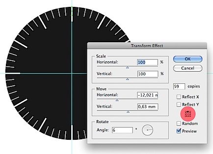 Note that the Reference Point Locator (in the red) has to be on top because the top of the box aligns with the edge of the circle. … Make a gradient with three color stops, gray to white, using these values: R 255, G 255, B 255 R 172, G 172, B 172 R 83, G 83, B 83 .
 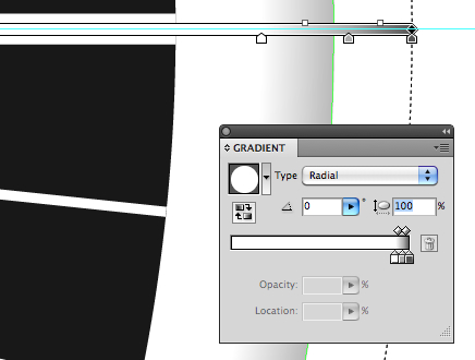 Grab the center of the Gradient Annotator and move it 2 mm to right and 2 mm up.
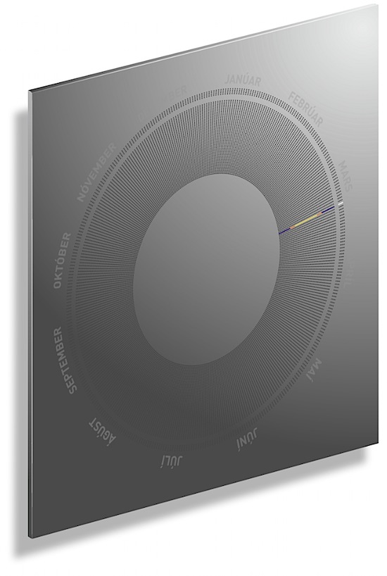 This is a concept for a diode light unit which I sent in for a competition held by The Illuminating Engineering Society of Iceland and Orkuveita Reykjavíkur (The Municipal Energy Grid). … You can choose between settings like showing only one day, where it also serves as a calendar, all the year at once, solstice, equinox or a clock and few other visual settings like running fast through every day of the year.